
UX Challenge: What Would You Do?
Sometimes a fresh perspective makes all the difference.
I recently needed to cancel a WebEx meeting. I clicked the menu item to cancel the meeting and was presented with this dialog box:
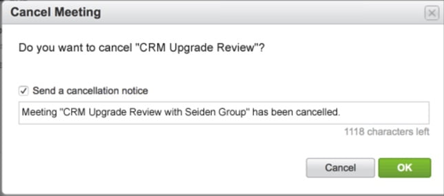
After a moment of hesitation, I clicked “OK,” but was briefly tempted by the “Cancel” button, since I wanted to cancel the meeting. It’s surprisingly easy to miss how users may see our applications. User experience (UX) design can make the difference between an app that your users love, and one that slows them down.
To help ensure enthusiastic adoption of your next application, consider getting experienced input on how to streamline workflow and add clarity and confidence for your users.
Don’t have a UX expert on staff? Contact us for a fresh look at your applications or to help you solve a thorny issue.
Feel free to comment on this post with your opinions about the Cancel/OK/No/Yes debate.
I stumbled upon this post while searching for something else. These kinds of problems are a pet peeve of mine. All the more because I have a book written in 1990 that offers UI designers the easy answer. Active verbs!
The only time “OK” should ever be used on a button is if it’s the only button on an informational (or perhaps an error you can do nothing about).
The buttons in your case should have read “Keep” and “Cancel”. However, because of the over-use of “Cancel” I would, in this case, use “Keep” and “Remove” and change the text to use “remove” as well.
Thanks for taking the time to add your thoughts, Allister. Active verbs make sense!
I actually deal with this in our system. We have the ability to cancel an order. I worked on it by having two buttons:
Cancel – This is the standard button to cancel an action.
Cancel The Order – So though it had another Cancel, I described the action you were to perform to clarify.
Because cancel can have so many meanings there isnt a perfect solution, but I wanted it to make sense in relation to everything else.
Thanks, King!